Thanks for stopping by, let's chat!

© 2024 Sauransh Gupta | Made with 💛 & 🍵
Next Steps
Expanding User Research:
To further refine SmoothRide's effectiveness and user engagement, I'll conduct usability testing with a wider range of participants. This broader user base will provide valuable insights that can be used to optimize the feature's functionality and user experience.
Live Speed Feature Development:
Some users during testing suggested syncing the motion cue animation with the speed of the vehicle, highlighting the potential for even greater experience.
Building on this, I am actively collaborating with developers to create a system that synchronizes the speed and direction of the motion cue with the vehicle movement. This "Live Speed" functionality, would allow SmoothRide to dynamically adjust based on whether a user is traveling in a car, bus or train. Testing this feature with a developer will help me determine the technical feasibility.
Exploring the Effects of Sound:
In addition to visual cues, I am considering the potential benefits of incorporating sound into the SmoothRide experience. By testing different sound options, I can determine if subtle audio cues can further enhance the effectiveness of SmoothRide.
Testing Live Speed: collaborating with a developer to sync animation speed of the red circle to match train speed
User Feedback as a Guiding Force:
The iterative design process, heavily reliant on user feedback, played a pivotal role in shaping the final version of SmoothRide.
User testing sessions identified areas for improvement and helped refine the overall user experience.
This experience reinforces the importance of prioritizing user needs throughout the design journey.
Collaboration is Key:
This case study stemmed from close collaboration between UX designers and developers, and other stakeholders.
Effective communication ensured a clear understanding of project goals and facilitated the creation of a seamless user experience.
This experience emphasizes the power of open communication in achieving successful design outcomes.
Prototyping for Accessibility:
Integrating accessibility testing into the prototyping stage would allow for earlier identification and mitigation of potential barriers for users with disabilities.
This would ensure a more inclusive design approach from the outset.
The learnings gleaned from the SmoothRide project will undoubtedly inform my future design endeavors. By prioritizing accessibility, user feedback, and clear communication, I aim to create user-centered experiences that are not only beautiful but also inclusive and effective.
Learnings
Conclusion
Final Prototype
Some Microinteractions
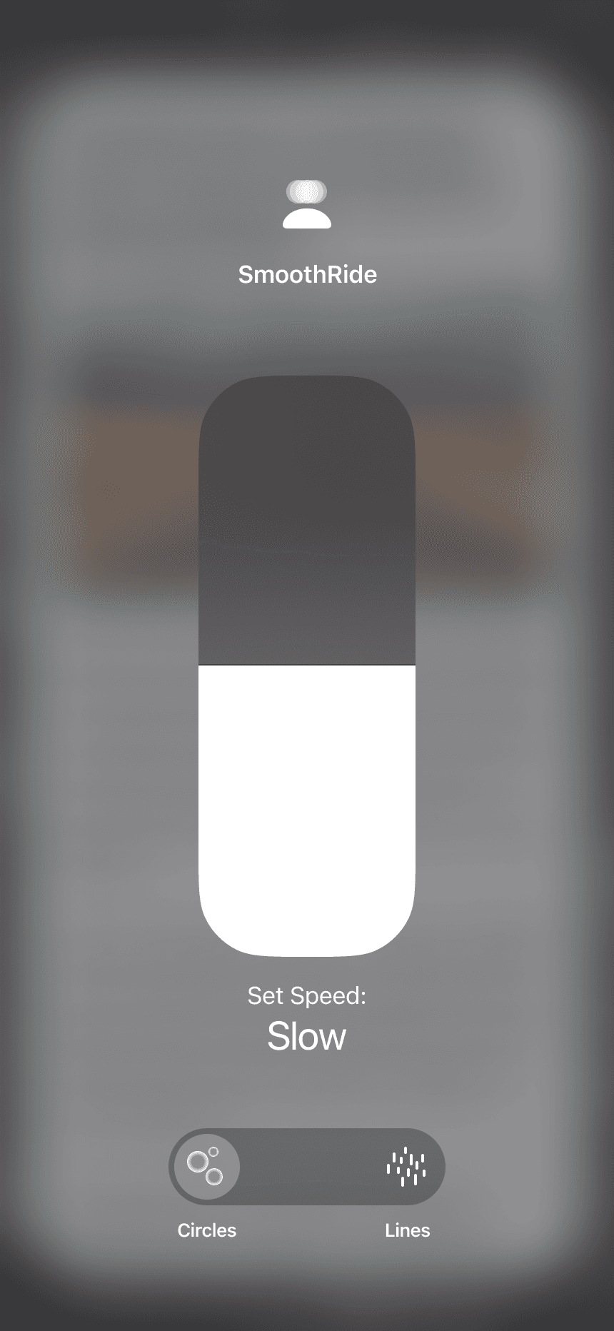
Tap activates the SmoothRide feature.
Long press reveals the SmoothRide settings.
Tap the “Live Speed” button to disable the manual speed control bar and instead dynamically adjust the motion cue animation based on the device's movement (e.g., speed of a car). This feature is currently under development.

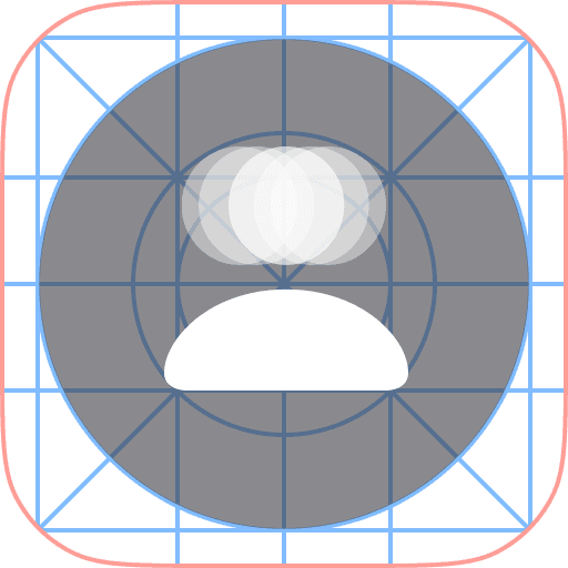
Animation depicting a distorted head returning to its normal state, symbolizing the mitigating effect of the feature on motion sickness.

“Live Speed” button animation of a car with moving lines representing motion.
The high-fidelity screens demonstrate the SmoothRide feature's integration within the screen borders. This approach achieves a balance between functionality and user experience:
Discreet Motion Cues: By placing the motion cue animations on the borders, we minimize distractions for users.
App Compatibility: Crucially, this border placement allows the feature to function seamlessly across various apps without requiring any modifications to the apps themselves.
Some of the High-Fidelity Screens
Accessibility & Feedback
Inclusive Visuals: I used icons alongside text to ensure information is universally understandable
WCAG Compliance: Every text meets the AA level standard of Web Content Accessibility Guidelines (WCAG) for maximum inclusivity
Touch Target : All touch targets meet the iOS Guidelines
Animation Control:
I moved the animation speed and style controls to the Control Center. This provides a more centralized and readily accessible location for adjustments.
Icons and Labels:
I implemented simple and clean icons for each animation style. The icons are accompanied by clear labels, ensuring users can easily identify and adjust settings based on their preferences.
Speed Control:
The speed control has been replaced with a slider bar. This provides a more intuitive interaction to adjust the animation speed.
Style Consistency:
All icons adhere to the SF Symbols guidelines and utilize the Apple Icon Production template.
Iconography:
The icon was revised to depict a "head" with a "disorientation" symbol. This combination more effectively communicates the purpose of the feature at a glance, allowing users to easily identify and activate the motion cue functionality.
Line Animation:
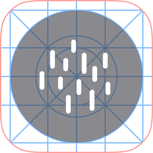
I increased the density of the line animation particles, making them stand out more prominently against the screen's background.
Viewport:
Removing the animation controls liberated valuable screen space, effectively increasing the viewport size. This provides users with more usable real estate to view content.
Changes After User Testing
Iconography:
All participants mentioned that the icon for the motion cue feature wasn't readily recognizable. To improve clarity, I explored new icon designs that effectively communicate the purpose of the feature at a glance.
First Wireframe
Evolution of Screens
Line Animation:
Participants identified difficulty seeing the line animations in bright outdoor environments. To address this, I explored thicker lines, bolder colors, and even alternative shapes for improved visibility.
Animation Control:
Participants mentioned that the animation control panel, was both difficult to press and obstructed valuable viewing space. To address this and prioritize a clean interface with a maximized content area, I opted to remove the animation control panel entirely and place it in the Control Center.
Observation:
Positive Impact:
All participants reported noticing a slight difference while using the motion cue.
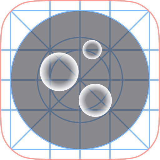
Several users expressed a preference for larger (circles) and slower-moving shapes
Considerations for Refinement:
An important environmental factor emerged during testing. One user, riding in a car on a sunny day , found the lines difficult to see. This emphasizes the need for adjustments to improve visibility in bright outdoor settings, where users are likely to use the feature.
User reactions to animation speed were divided. While some users disliked faster animations, particularly lines, others found them preferable. This highlights the need for further exploration and potential customization.
The testing revealed that the controls positioned near the bottom of the screen were too close to the Home Indicator, making them challenging to press.
PS – Omitting additional insights and feedback to keep the case study concise.
Due to time and resource constraints, I conducted the initial user testing with 4 participants (21-45 age group) who experience motion sickness. While a larger and more diverse sample size would be ideal, this initial round proved valuable in evaluating crucial design decisions.
Testing Objectives:
Effectiveness: Assess whether the motion cue offers any relief from motion sickness symptoms while reading.
Visual Preferences: Evaluate user responses to different animation shapes (e.g., lines, circles) and speeds.
Testing Conditions:
The testing took place within moving vehicles such as trains, buses, or cars. Participants were required to face the direction of travel, aligning their body's movement with the motion cue on the screen.
Learnings from Testing the Low-fi Prototype
Low Fidelity Screens
Based on research findings, reading emerged as the most common activity affected by motion sickness while using smartphones. Therefore, Low Fidelity User Testing primarily focused on the user's experience while reading content with the motion cue enabled.
Viewport Reduction:
Inspired by the app-switching feature on iOS, I opted to shrink the viewport (the visible content area). This creates more real estate on the edges of the screen.
iOS app-switching feature
Line Animations:
For the initial iteration, I opted for a simple animation using lines. These lines will subtly flow, providing a visual representation for the perception of motion.
Motion on Edges:
Discussions with developers revealed a limitation with Apple's system. Apps do not have the permission to overlay elements directly on top of the viewport for privacy reasons.
To ensure the feature's app-agnostic nature, motion cue animations will be displayed in the newly created space on the edges, effectively running outside the app's real estate. This approach draws inspiration from the iOS Reachability Accessibility feature, that lets users to move the entire viewport down for easier one-handed use.
Benefits of Motion on Edges:
App Compatibility: By staying outside the app's viewport, the animations avoid the need for app-specific permissions, making the feature more widely applicable.
Non-distracting visuals: With the animations relegated to the corners, the user's primary content remains unobstructed and in focus. This aligns with the core objective of creating a non-distracting visual cue.
iOS Reachability Accessibility feature

Wireframe Sketch
Layout of the Product
The design process focused on creating a user interface that effectively integrates the motion cue while maintaining a clear and unobtrusive experience. Here's a breakdown of the key layout decisions:
Source: iMessage Invisible Ink Effect
Particle Movement Visual
Source: Atomus iOS App
Drawing inspiration from various sources, I explored different ways to create a dynamic visual cue on the smartphone screen that reinforces the user's perception of motion.
Exploration for Visual Cue of motion on Screen
Design Process
How might we create a visual cue on the smartphone screen that matches the vehicle’s motion, complementing the user's physical sensation of movement and potentially leading to less motion sickness?
This reframes the problem as a design challenge potentially leading to a more comfortable user experience.
How I came up with the idea
Based on the survey responses and interview insights, a recurring theme emerged: motion sickness disrupts users' ability to focus on static phone screens. This suggests a conflict between the visual information (static screen) and the body's perception of movement.
Key Takeaway: To alleviate motion sickness, perhaps we can provide an additional visual cue through the smartphone that aligns with the body's feeling of movement.

Sarah Chen
Demographic & Psychographic Traits
Age
32
Gender
Female
Education
Masters in Business
Status
Single
Occupation
Sales Manager
Income
CA$90,000 per annum
Location
Vancouver, Canada
Personality
Tech-savvy
Health-conscious
Social
Results-oriented
Interests
Travel
Reading
Music
Behaviors & Actions
Frequent Commuter & Avid Traveller: Sarah uses public transportation (trains, buses and cabs) for her daily commute and frequently embarks on leisure trips.
Tech-Savvy & On-the-Go: She relies heavily on her smartphone throughout the day, using it to stay connected, manage tasks, and even be productive while traveling.
Routine-Oriented & Organized: Sarah thrives on structure and prioritization. She uses calendars, to-do lists, and other organizational tools to maintain a balanced schedule.
Needs & Pain Points
Motion Sickness: This disrupts Sarah's travel routine. Focusing on her phone screen while in transit triggers nausea and makes it difficult to read, watch videos, or complete tasks.
Time Management Juggle: Balancing work commitments, personal life, and leisure activities proves challenging with her busy schedule. Sarah is constantly seeking ways to maximize efficiency and use her travel time productively.
Persona
“The only thing I can do is not use it (smartphone) at all. Once I start feeling nauseous the only thing that will stop it from getting worse is to open the window or look outside.”
Hint: Gazing out the window provides a natural visual cue of movement.
“ My 11 year old brother gets carsick easily, but he's perfectly fine when he is playing a racing game on his device!”
Hint: Visual cue of motion on a static phone
Key Insights
Unpleasant Symptoms: Users experience a range of symptoms, including nausea, headache, dizziness, lightheadedness, feeling like throwing up, blurry vision, and hot sweats which leads to sustained frustration in their daily lives.
Visual Focus Management: Current strategies to combat motion sickness often involve focusing on the motion outside the vehicle. Some users also find relief by opening windows to feel the wind against their skin. These behaviors support the hypothesis that perceiving motion visually and through other senses can help synchronize the body's signals and reduce nausea.
Convenience Matters: The affinity map highlights that users haven't actively sought out new motion sickness apps. However, they are very receptive to exploring and using a feature that's built-in and readily accessible on their devices. This suggests that an integration within the user’s existing device could be a significant advantage in user adoption.
Brings disappointment
Feels like throwing up and vision gets a little blurry
Readings books while traveling makes them sick
Nausea
Feeling hot and sweaty
Headache
Annoyed to not be able to use their smartphone during travel
Haven’t come across anything, open to exploring
Maybe hearing feature instead of having to read everything
Update in the contrast of the screen
Would be way more helpful if it is made as a built-in feature which convenient to use daily
Eye tracking while using phone to probably see any relation
Light-headed, dizzy
Prefer to drive instead of being a passenger
Stops using the phone completely
Close my eyes
Lay back in the seat
Maybe open window a little
Looking outside at motion, opening the window to feel the wind motion against the skin helps
Not read too much, limit smartphone usage
Using mints or chews on candy
Sits near the window or in the front street where the outside view is unobstructed
Takes a pill to avoid it
Listening to music while looking outside - to distract from the sick feeling
Staring out the window and deep breathing
Drinking orange juice
Prefers to not eat before or during traveling
In car
In bus
In trains in North America
Smell of oil burning or of the engine causing the sick feeling
When not driving and is just a passenger in car
Plane during turbulence
Any enclosed vehicle
Traveling up mountain roads
Loss of appetite
Gets bored
Texting
Sharing travel experience to social media
Booking accommodations
Quickly checking and responding to work-related emails
To switch between episodes of podcasts and audiobooks
Watching a movie
Scrolling social media
Navigating using Google Maps
Using a browser to search for something
Had to read out from the phone for driver
Playing a game - rejuvenatary purposes
Places of occurrence
Regular smartphone usage of users
Common Strategies / existing coping mechanism to avoid motion sickness
Symptoms
Potential features in a smartphone to avoid motion sickness
Frustrations due to motion sickness
I sorted the notes from the 55 survey responses and 5 interviews and categorized them to find commonalities.
Affinity Map (Survey + Interviews)
Competitor Analysis
Strengths
non intrusive way to mitigate motion sickness
can also be used in treating anxiety
Overall positive response
Weaknesses
Needs an Apple Watch to work
uncomfortable to wear the watch up-side down

Sense Relief
The app delivers acupressure through the Apple Watch vibrations to specific points on the body.
Strengths
Works effectively
Many customization options (especially for children)
Weaknesses
Visually very intrusive and distracting
Tested with a user
Technically this will not work with Apple as it requires a visual overlay on the entire screen on each app and will need permission from all apps
KineStop
This app focuses on visual comfort by simulating a horizon overlay on your mobile device screen.
46% of car passengers report some level of carsickness in the past five years.
Source: ScienceDirect
Incidence differs consistently by age and gender.
(female > male;
young > old)
Source: ScienceDirect
Hormones – fluctuations during pregnancy and the menstrual cycle increase susceptibility
Source: National Library of Medicine
A University of Michigan study warns that passengers in self-driving cars might be more susceptible to motion sickness. The culprit? Lack of visual cues from driving! Their findings highlight the need for solutions to motion sickness as we transition to a future with more autonomous vehicles.
Source: University of Michigan
Depending on the immersive content, 20%-95% of users typically experience some form of cybersickness (AR/VR).
Source: Frontiers
Research
Secondary Research
Conceptual Visualisation of the Solution
Bring a slice of the outside world into user’s device, creating a visual reference point that helps their brain sync up with the motion outside
Solution
About one in three people* experience motion sickness, and nearly half of car passengers deal with carsickness.
This poses a significant challenge – motion sickness is a big roadblock, stopping users from using their devices efficiently while traveling.
This limitation results in wasted time, preventing users from optimizing productivity, completing tasks, or enjoying entertainment on their devices while traveling.
Problem
How Might We...
... design an intuitive non-distracting and user-centric solution that effectively addresses motion sickness, enabling users to seamlessly use their devices during travel?
The goal is to empower users to maximize their productivity effectively, especially with their busy schedules.
Outside the train window, the world rushes by, while everything inside remains still.

Understanding the Problem
Motion sickness happens when our senses get confused!
Our eyes see a stationary phone screen, while body feels the motion of the moving vehicle. This mixed message can trick our brain and lead to an unpleasant feeling of nausea.
UX Case Study
Motion Sickness Accessibility Feature for iOS
SmoothRide
TIMELINE
Jan - May 2024
SECTOR
Accessibility
DESIGN ROLE
UX Research
UI Design
Usability Testing
Motion Graphics
Branding
Tools
Figma
Useberry
After Effects
NotebookLM
Google Gemini
ChatGPT
Ideogram AI
Thanks for stopping by, let's chat!
© 2024 Sauransh Gupta | Made with 💛 & 🍵
Testing Live Speed: collaborating with a developer to sync animation speed of the red circle to match train speed
Expanding User Research:
To further refine SmoothRide's effectiveness and user engagement, I'll conduct usability testing with a wider range of participants. This broader user base will provide valuable insights that can be used to optimize the feature's functionality and user experience.
Exploring the Effects of Sound:
In addition to visual cues, I am considering the potential benefits of incorporating sound into the SmoothRide experience. By testing different sound options, I can determine if subtle audio cues can further enhance the effectiveness of SmoothRide.
Live Speed Feature Development:
Some users during testing suggested syncing the motion cue animation with the speed of the vehicle, highlighting the potential for even greater experience.
Building on this, I am actively collaborating with developers to create a system that synchronizes the speed and direction of the motion cue with the vehicle movement. This "Live Speed" functionality, would allow SmoothRide to dynamically adjust based on whether a user is traveling in a car, bus or train. Testing this feature with a developer will help me determine the technical feasibility.
Next Steps
User Feedback as a Guiding Force:
The iterative design process, heavily reliant on user feedback, played a pivotal role in shaping the final version of SmoothRide.
User testing sessions identified areas for improvement and helped refine the overall user experience.
This experience reinforces the importance of prioritizing user needs throughout the design journey.
Collaboration is Key:
This case study stemmed from close collaboration between UX designers and developers, and other stakeholders.
Effective communication ensured a clear understanding of project goals and facilitated the creation of a seamless user experience.
This experience emphasizes the power of open communication in achieving successful design outcomes.
Prototyping for Accessibility:
Integrating accessibility testing into the prototyping stage would allow for earlier identification and mitigation of potential barriers for users with disabilities.
This would ensure a more inclusive design approach from the outset.
The learnings gleaned from the SmoothRide project will undoubtedly inform my future design endeavors. By prioritizing accessibility, user feedback, and clear communication, I aim to create user-centered experiences that are not only beautiful but also inclusive and effective.
Learnings
Conclusion
Final Prototype
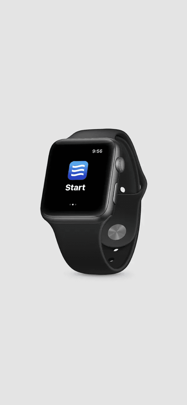
Tap activates the SmoothRide feature.
Long press reveals the SmoothRide settings.
Tap the “Live Speed” button to disable the manual speed control bar and instead dynamically adjust the motion cue animation based on the device's movement (e.g., speed of a car). This feature is currently under development.
Animation depicting a distorted head returning to its normal state, symbolizing the mitigating effect of the feature on motion sickness.
“Live Speed” button animation of a car with moving lines representing motion.
Some Microinteractions
Some of the High-Fidelity Screens
Motion Cue ON:
Lines Animation
Motion Cue ON:
Circles Animation
Motion Cue ON:
Light Wallpaper Screen
Control Conter
Control Conter
The high-fidelity screens demonstrate the SmoothRide feature's integration within the screen borders. This approach achieves a balance between functionality and user experience:
Discreet Motion Cues: By placing the motion cue animations on the borders, we minimize distractions for users.
App Compatibility: Crucially, this border placement allows the feature to function seamlessly across various apps without requiring any modifications to the apps themselves.
Accessibility & Feedback
Inclusive Visuals: I used icons alongside text to ensure information is universally understandable
WCAG Compliance: Every text meets the AA level standard of Web Content Accessibility Guidelines (WCAG) for maximum inclusivity
Touch Target : All touch targets meet the iOS Guidelines
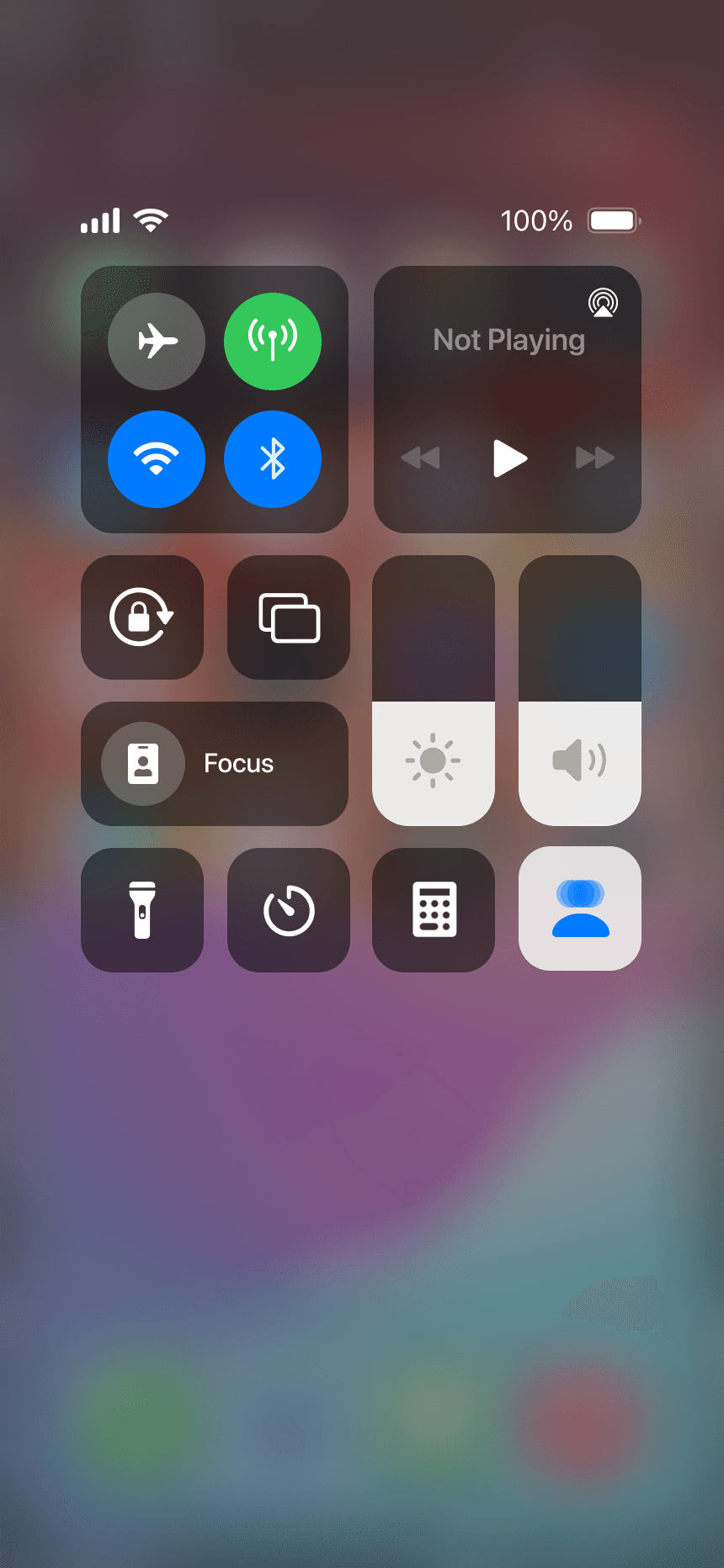
Animation Control:
I moved the animation speed and style controls to the Control Center. This provides a more centralized and readily accessible location for adjustments.
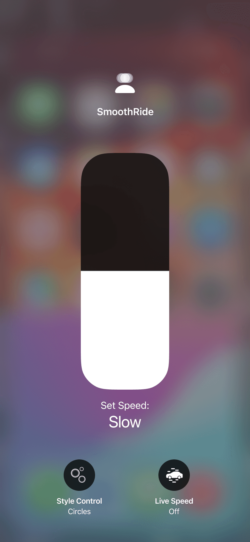
Icons and Labels:
I implemented simple and clean icons for each animation style. The icons are accompanied by clear labels, ensuring users can easily identify and adjust settings based on their preferences.
Speed Control:
The speed control has been replaced with a slider bar. This provides a more intuitive interaction to adjust the animation speed.
Style Consistency:
All icons adhere to the SF Symbols guidelines and utilize the Apple Icon Production template.
Iconography:
The icon was revised to depict a "head" with a "disorientation" symbol. This combination more effectively communicates the purpose of the feature at a glance, allowing users to easily identify and activate the motion cue functionality.
Line Animation:
I increased the density of the line animation particles, making them stand out more prominently against the screen's background.
Viewport:
Removing the animation controls liberated valuable screen space, effectively increasing the viewport size. This provides users with more usable real estate to view content.
Changes After User Testing
Iconography:
All participants mentioned that the icon for the motion cue feature wasn't readily recognizable. To improve clarity, I explored new icon designs that effectively communicate the purpose of the feature at a glance.
First Wireframe
Evolution of Screens
Line Animation:
Participants identified difficulty seeing the line animations in bright outdoor environments. To address this, I explored thicker lines, bolder colors, and even alternative shapes for improved visibility.
Animation Control:
Participants mentioned that the animation control panel, was both difficult to press and obstructed valuable viewing space. To address this and prioritize a clean interface with a maximized content area, I opted to remove the animation control panel entirely and place it in the Control Center.
Observation:
Positive Impact:
All participants reported noticing a slight difference while using the motion cue.
Several users expressed a preference for larger (circles) and slower-moving shapes
Considerations for Refinement:
An important environmental factor emerged during testing. One user, riding in a car on a sunny day , found the lines difficult to see. This emphasizes the need for adjustments to improve visibility in bright outdoor settings, where users are likely to use the feature.
User reactions to animation speed were divided. While some users disliked faster animations, particularly lines, others found them preferable. This highlights the need for further exploration and potential customization.
The testing revealed that the controls positioned near the bottom of the screen were too close to the Home Indicator, making them challenging to press.
PS – Omitting additional insights and feedback to keep the case study concise.
Due to time and resource constraints, I conducted the initial user testing with 4 participants (21-45 age group) who experience motion sickness. While a larger and more diverse sample size would be ideal, this initial round proved valuable in evaluating crucial design decisions.
Testing Objectives:
Effectiveness: Assess whether the motion cue offers any relief from motion sickness symptoms while reading.
Visual Preferences: Evaluate user responses to different animation shapes (e.g., lines, circles) and speeds.
Testing Conditions:
The testing took place within moving vehicles such as trains, buses, or cars. Participants were required to face the direction of travel, aligning their body's movement with the motion cue on the screen.
Learnings from Testing the Low-fi Prototype
Low Fidelity Screens
Based on research findings, reading emerged as the most common activity affected by motion sickness while using smartphones. Therefore, Low Fidelity User Testing primarily focused on the user's experience while reading content with the motion cue enabled.

Motion Cue OFF
Motion Cue ON:
Slow-Circles Animation
Motion Cue ON:
Fast-Circles Animation
Motion Cue ON:
Slow-Lines Animation
Motion Cue ON:
Fast-Lines Animation
Viewport Reduction:
Inspired by the app-switching feature on iOS, I opted to shrink the viewport (the visible content area). This creates more real estate on the edges of the screen.
iOS app-switching feature
Line Animations:
For the initial iteration, I opted for a simple animation using lines. These lines will subtly flow, providing a visual representation for the perception of motion.
Motion on Edges:
Discussions with developers revealed a limitation with Apple's system. Apps do not have the permission to overlay elements directly on top of the viewport for privacy reasons.
To ensure the feature's app-agnostic nature, motion cue animations will be displayed in the newly created space on the edges, effectively running outside the app's real estate. This approach draws inspiration from the iOS Reachability Accessibility feature, that lets users to move the entire viewport down for easier one-handed use.
iOS Reachability Accessibility feature
Benefits of Motion on Edges:
App Compatibility: By staying outside the app's viewport, the animations avoid the need for app-specific permissions, making the feature more widely applicable.
Non-distracting visuals: With the animations relegated to the corners, the user's primary content remains unobstructed and in focus. This aligns with the core objective of creating a non-distracting visual cue.
Wireframe Sketch
Layout of the Product
The design process focused on creating a user interface that effectively integrates the motion cue while maintaining a clear and unobtrusive experience. Here's a breakdown of the key layout decisions:
Source: iMessage Invisible Ink Effect
Particle Movement Visual
Source: Atomus iOS App
Drawing inspiration from various sources, I explored different ways to create a dynamic visual cue on the smartphone screen that reinforces the user's perception of motion.
Exploration for Visual Cue of motion on Screen
Design Process
How might we create a visual cue on the smartphone screen that matches the vehicle’s motion, complementing the user's physical sensation of movement and potentially leading to less motion sickness?
This reframes the problem as a design challenge potentially leading to a more comfortable user experience.
How I came up with the idea
Based on the survey responses and interview insights, a recurring theme emerged: motion sickness disrupts users' ability to focus on static phone screens. This suggests a conflict between the visual information (static screen) and the body's perception of movement.
Key Takeaway: To alleviate motion sickness, perhaps we can provide an additional visual cue through the smartphone that aligns with the body's feeling of movement.
Sarah Chen
Demographic & Psychographic Traits
Age
32
Gender
Female
Education
Masters in Business
Status
Single
Income
CA$90,000 per annum
Occupation
Sales Manager
Location
Vancouver, Canada
Personality
Tech-savvy
Health-conscious
Social
Results-oriented
interests
Travel
Reading
Music
Behaviors & Actions
Frequent Commuter & Avid Traveller: Sarah uses public transportation (trains, buses and cabs) for her daily commute and frequently embarks on leisure trips.
Tech-Savvy & On-the-Go: She relies heavily on her smartphone throughout the day, using it to stay connected, manage tasks, and even be productive while traveling.
Routine-Oriented & Organized: Sarah thrives on structure and prioritization. She uses calendars, to-do lists, and other organizational tools to maintain a balanced schedule.
Needs & Pain Points
Motion Sickness: This disrupts Sarah's travel routine. Focusing on her phone screen while in transit triggers nausea and makes it difficult to read, watch videos, or complete tasks.
Time Management Juggle: Balancing work commitments, personal life, and leisure activities proves challenging with her busy schedule. Sarah is constantly seeking ways to maximize efficiency and use her travel time productively.
Proto Persona
“The only thing I can do is not use it (smartphone) at all. Once I start feeling nauseous the only thing that will stop it from getting worse is to open the window or look outside.”
Hint: Gazing out the window provides a natural visual cue of movement.
“ My 11 year old brother gets carsick easily, but he's perfectly fine when he is playing a racing game on his device!”
Hint: Visual cue of motion on a static phone
Key Insights
Unpleasant Symptoms: Users experience a range of symptoms, including nausea, headache, dizziness, lightheadedness, feeling like throwing up, blurry vision, and hot sweats which leads to sustained frustration in their daily lives.
Visual Focus Management: Current strategies to combat motion sickness often involve focusing on the motion outside the vehicle. Some users also find relief by opening windows to feel the wind against their skin. These behaviors support the hypothesis that perceiving motion visually and through other senses can help synchronize the body's signals and reduce nausea.
Convenience Matters: The affinity map highlights that users haven't actively sought out new motion sickness apps. However, they are very receptive to exploring and using a feature that's built-in and readily accessible on their devices. This suggests that an integration within the user’s existing device could be a significant advantage in user adoption.
Brings disappointment
Readings books while traveling makes them sick
Annoyed to not be able to use their smartphone during travel
Loss of appetite
Gets bored
Feels like throwing up and vision gets a little blurry
Nausea
Feeling hot and sweaty
Headache
Light-headed, dizzy
Prefer to drive instead of being a passenger
Stops using the phone completely
Close my eyes
Lay back in the seat
Maybe open window a little
Looking outside at motion, opening the window to feel the wind motion against the skin helps
Not read too much, limit smartphone usage
Using mints or chews on candy
Sits near the window or in the front street where the outside view is unobstructed
Takes a pill to avoid it
Listening to music while looking outside - to distract from the sick feeling
Staring out the window and deep breathing
Drinking orange juice
Prefers to not eat before or during traveling
In car
In bus
In trains in North America
Smell of oil burning or of the engine causing the sick feeling
When not driving and is just a passenger in car
Plane during turbulence
Any enclosed vehicle
Traveling up mountain roads
Places of occurrence
Common Strategies / existing coping mechanism to avoid motion sickness
Symptoms
Frustrations due to motion sickness
Haven’t come across anything, open to exploring
Maybe hearing feature instead of having to read everything
Update in the contrast of the screen
Would be way more helpful if it is made as a built-in feature which convenient to use daily
Eye tracking while using phone to probably see any relation
Potential features in a smartphone to avoid motion sickness
Texting
Sharing travel experience to social media
Booking accommodations
Quickly checking and responding to work-related emails
To switch between episodes of podcasts and audiobooks
Watching a movie
Scrolling social media
Navigating using Google Maps
Using a browser to search for something
Had to read out from the phone for driver
Playing a game - rejuvenatary purposes
Regular smartphone usage of users
I sorted the notes from the 55 survey responses and 5 interviews and categorized them to find commonalities.
Affinity Map (Survey + Interviews)
Primary Research
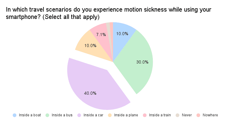
40% of responses mentioned that cars were the most motion sickness-causing mode of transportation.
Motion Sickness While Using Smartphones in Different Travel Scenarios
Motion Sickness While Using Smartphones in Different Travel Scenarios
As a result of these findings, the Minimum Viable Product (MVP) for the low-fidelity test was designed to focus on reading, allowing me to gather insights into the most prevalent motion sickness-inducing scenario.
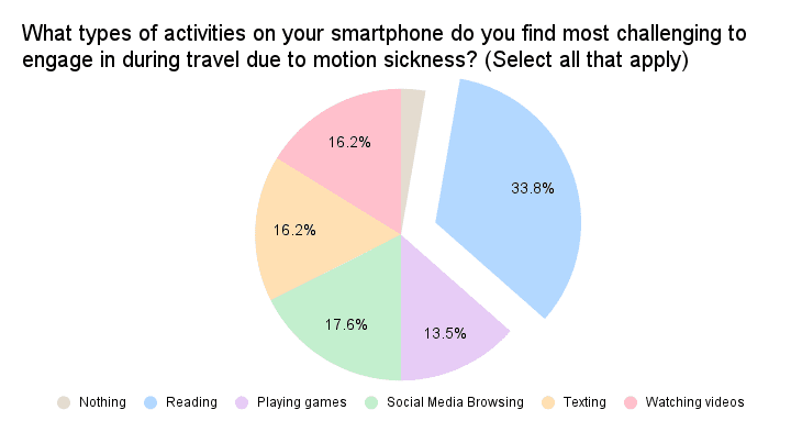
Motion Sickness Challenges when Using Smartphones
“I get motion sick if I read too much text on my phone or in a book while travelling by car or bus....”
“I get motion sick if I read too much text on my phone or in a book while travelling by car or bus....”
I surveyed a focused sample size and collected 55 responses which proved insightful. My questions ranged from statistical to open end questions.
Around 65% of respondents mention that they experience motion sickness to varying degrees.
Evidence from the survey indicates that reading is the most common activity that triggers motion sickness while using a smartphone during travel:
Reading was on the list of around 34% of users who get motion sickness of some level.
Survey
Strengths
Works effectively
Many customization options (especially for children)
Weaknesses
Visually very intrusive and distracting
Tested with a user
Technically this will not work with Apple as it requires a visual overlay on the entire screen on each app and will need permission from all apps
Strengths
non intrusive way to mitigate motion sickness
can also be used in treating anxiety
Overall positive response
Weaknesses
Needs an Apple Watch to work
uncomfortable to wear the watch up-side down
Sense Relief
The app delivers acupressure through the Apple Watch vibrations to specific points on the body.
Competitor Analysis
KineStop
This app focuses on visual comfort by simulating a horizon overlay on your mobile device screen.
Research
Secondary Research
46% of car passengers report some level of carsickness in the past five years.
Source: ScienceDirect
Incidence differs consistently by age and gender.
(female > male;
young > old)
Source: ScienceDirect
Hormones – fluctuations during pregnancy and the menstrual cycle increase susceptibility
Source: National Library of Medicine
A University of Michigan study warns that passengers in self-driving cars might be more susceptible to motion sickness. The culprit? Lack of visual cues from driving! Their findings highlight the need for solutions to motion sickness as we transition to a future with more autonomous vehicles.
Source: University of Michigan
Depending on the immersive content, 20%-95% of users typically experience some form of cybersickness (AR/VR).
Source: Frontiers
Conceptual Visualisation of the Solution
Bring a slice of the outside world into user’s device, creating a visual reference point that helps their brain sync up with the motion outside
Solution
Outside the train window, the world rushes by, while everything inside remains still.
Understanding the Problem
Motion sickness happens when our senses get confused!
Our eyes see a stationary phone screen, while body feels the motion of the moving vehicle. This mixed message can trick our brain and lead to an unpleasant feeling of nausea.
How Might We...
... design an intuitive non-distracting and user-centric solution that effectively addresses motion sickness, enabling users to seamlessly use their devices during travel?
The goal is to empower users to maximize their productivity effectively, especially with their busy schedules.
About one in three people* experience motion sickness, and nearly half of car passengers deal with carsickness.
This poses a significant challenge – motion sickness is a big roadblock, stopping users from using their devices efficiently while traveling.
This limitation results in wasted time, preventing users from optimizing productivity, completing tasks, or enjoying entertainment on their devices while traveling.
Problem
UX Case Study
Motion Sickness Accessibility Feature for iOS
SmoothRide
TIMELINE
Jan - May 2024
SECTOR
Accessibility
DESIGN ROLE
Motion Graphics
Branding
UX Research
UI Design
Usability Testing
Tools
Figma
Useberry
After Effects
NotebookLM
Google Gemini
ChatGPT
Ideogram AI
